
Why cram more data into less space?
Perspectives

We live in an age of spectacular contradiction. Every second, humanity generates 2.5 quintillion bytes of data, enough to fill 10 million Blu-ray discs. Our smartphones track our steps, our hearts, our sleep patterns. Our governments publish terabytes of economic indicators. Our scientists sequence genomes, model climates, and map neural networks. We have more data about our world than at any point in human history.
And yet we've never been more confused.
The average decision maker, whether CEO, policymaker, or citizen, feels less informed today than a decade ago. We're drowning in numbers while thirsting for insight. We have petabytes of precision but lack the patterns. We measure everything and understand nothing.
The paradox is striking: we generate more data than ever, yet understand less. The problem is that we don’t visualise data well. In our attempt to fix this issue, we strip away context, simplify things to the point of meaninglessness, and wonder why we can't see what's actually happening.
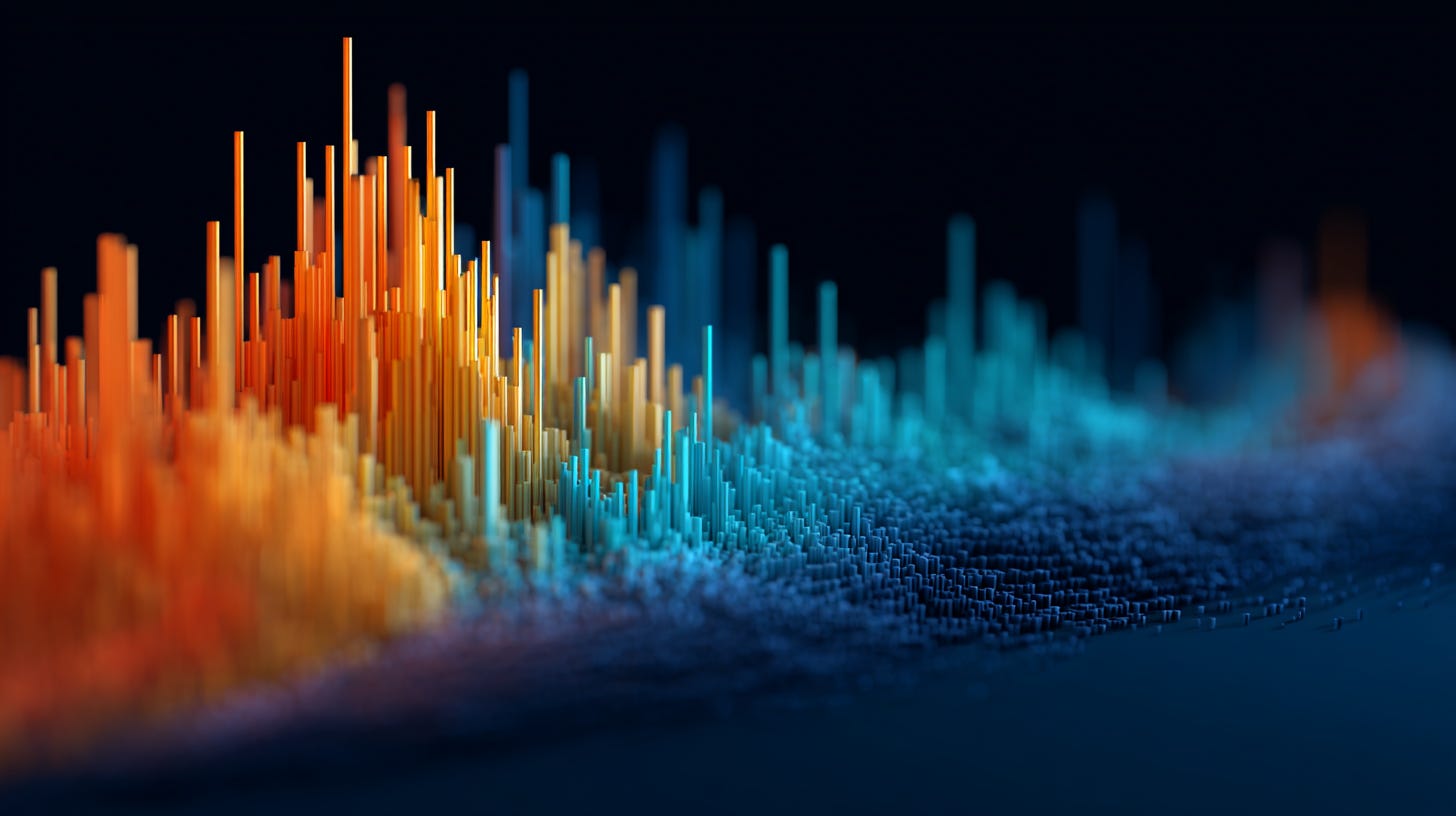
The solution lies in embracing density: showing more data, not less, in the same visual space.
What density actually looks like
Consider Chartfleau's animated swarm plot of the S&P 500. Each company appears as a bubble sized by market cap, organised by sector, rising and falling with performance.
What you are watching are 500 stocks move simultaneously. A simplified version showing just sector averages would tell you technology is up 20%. But that hides the real story: which stocks are driving that gain? Is it broad growth or just Nvidia soaring 200% while others stagnate?
Dense visualisation lets you see both the forest and the trees. You can track sector trends while spotting the individual outliers that actually move markets. The same screen space that could show 11 boring bars instead reveals 500 stories.
Source: Chartfleau
Here's another one that I made during the regional banking crisis in the US, back in the spring of 2023. Just like Chartfeau's animated swarmplot, I've used a similar technique to map the stock market performance of all the US regional banks after the collapse of Silicon Valley Bank.
What you will notice is that Silicon Valley Bank is missing because it's no longer listed after being taken over by the FDIC. What's intriguing about this whole episode is that it wasn't actually a crisis. Notice that as the animation plays, although many regional banks declined, they didn't enter distressed territory.
The vast majority actually didn't even achieve bear market returns and stayed above minus 20%. I used colour to indicate those banks that ran into trouble, with red being trouble. And those banks that I've listed in red are mere outliers. The sector experienced a correction but not a crisis and quickly recovered afterwards.
Of course, you can use other visualisation techniques to show data density and the stories hidden within. I often do this with the yield curve by capturing the continuous shift in the yield curve with ghost lines. What you see are the impressions left by previous yield curves piled up on each other to give you a sense of the direction and movement the yield curve is taking. It represents a far richer story and compresses it into a single data visualisation that you need just a minute to observe.
Here are some other examples.
A plane’s cockpit contains multiple data dense visualisations to help a pilot tackle the complexity of aviation.

In hospitals, data visualisation is used for a variety of purposes: from CAT scans to monitoring a patient's vitals.

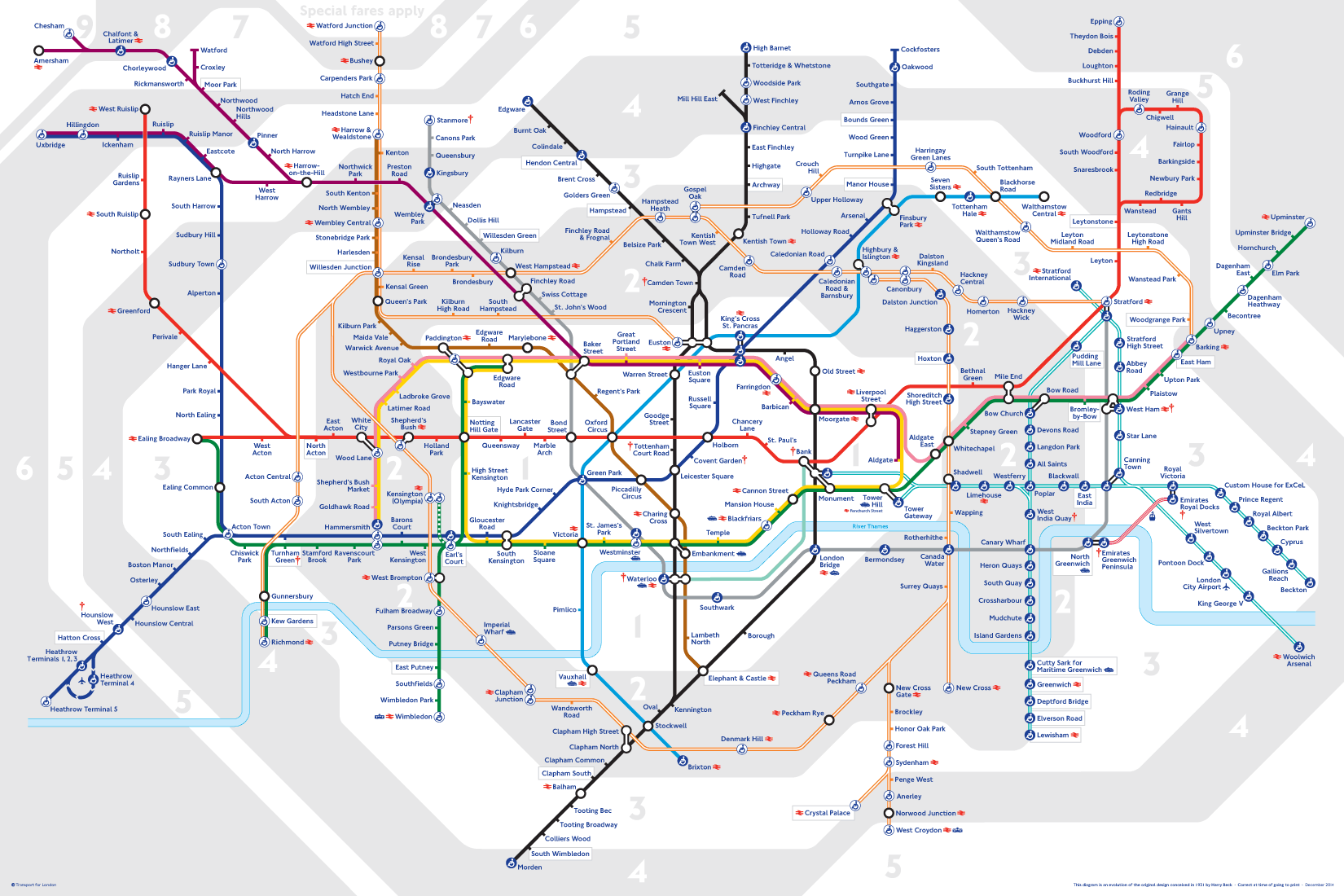
We even use it for transport. The London Underground map achieves remarkable data density by stripping away geographical accuracy to compress the entire network's connectivity into a compact space, with every intersection, line overlap, and station point encoding multiple layers of information. Beck's design shows that effective data density isn't just about adding more data points, but about abstracting and reorganising information so that complex relationships become visible and comprehensible at a glance.
Why we sometimes fail at density
Look at how we present data today. Single line charts of GDP growth. Bar graphs of quarterly sales. Pie charts of market share. Each so stripped of context it tells us nothing about reality.
Climate change offers the starkest example. We have satellite measurements, ice core data, atmospheric readings from thousands of stations. Yet most climate visualisations show a single upward line. No wonder people don't grasp the urgency. They can't see Arctic acceleration, ocean feedback loops, or cascading ecosystem risks. The story isn't in one line; it's in ten thousand interconnected trends.
During the pandemic, we watched daily case counts on simple charts. But those sparse visualisations hid the real patterns: waves through age cohorts, geographic clusters, variant transitions, hospital capacity constraints. Countries using dense, multi-layered dashboards like South Korea controlled the virus better than those relying on simplified metrics.
Your brain wants density
The human visual system processes information at 1.25 gigabytes per second. We evolved to scan dense forests for predators, read weather in cloud formations, track dozens of tribe members simultaneously. Yet we've convinced ourselves that modern humans can't handle more than seven data points on a chart.
The Bloomberg Terminal proves this wrong. Financial traders stare at screens packed with hundreds of data streams: real-time prices for dozens of securities, order books across exchanges, news feeds, technical indicators, correlation matrices, portfolio risk metrics. They pay $30,000 annually for maximum density because it works. When you can see everything at once, patterns emerge that sequential viewing never reveals.
The democracy of data
By keeping visualisation simple, we've made data elitist. When charts show only summary statistics, only those with raw data access see the full truth. Everyone else accepts the curator's interpretation.
Dense data visualisation is transparent. When you show all the data, including outliers and uncertainty, you can't cherry-pick. You can't hide inconvenient truths. The data speaks for itself.
In a world where every major challenge involves interconnected systems, our refusal to embrace dense visualisation is dangerous.
When voters can't see the full picture of economic inequality – the entire distribution, geographic variations, generational trends – they make political choices based on slogans. When doctors can't see disease progression patterns across thousands of patients, they miss early warnings. When policymakers can't see cascade effects across systems, they create new problems while solving old ones.
Dense visualisation isn't just a better way to show data. In our data-drenched age, it's the only way to stay afloat.